This site hasn’t been updated since 2012. You can still peruse who I was back then, but know that much of what I think, feel, write, and do has changed. I still occassionally take on interesting projects/clients, so feel free to reach out if that’s what brought you here. — Nishant
A few weeks ago Microsoft silently launched a new home page. It was meant to be a temporary launch for the purposes of some preliminary testing. But as fate would have it, it became the talk of the Internet. Twitter was abuzz with opinions. Several blogs and online news sites, including The Verge, wrote about it. And, the reviews were overwhelmingly positive. Even Gruber gave it two thumbs up.

This week marked the real launch of the new Microsoft.com home page. And as someone who has been involved on and off with the project from the moment it was conceived, I thought I'd tell you the story, albeit extensively abridged, behind the new Microsoft.com.
Grab a seat.
"Will you meet with my team and talk to them about modern web design and development?" asked my wife, Pita, as she walked through our front door one evening. "This an important year for Microsoft. Our home page needs to be a leader on the Web on every front."
My wife recently took over as Director of Program Management for the Microsoft.com team. Her team is the middle prong in the trident that produces any web site under the Microsoft.com domain. An engineering team implements the actual solutions that are designed by a group of marketers and designers; among other things, Pita's team oversees the proper execution of the projects. Pita wanted me to meet with the all the teams involved to share some lessons on modern web development: something I generally do exclusively at industry conferences.
"It's not my job!", I protested. She responded, "You're my husband, Nishant." That was that.


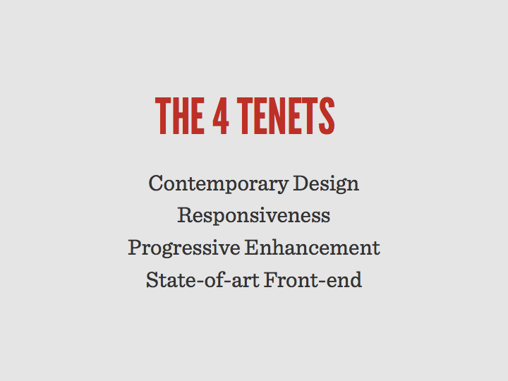
So, I prepared and delivered an hour long presentation wherein I outlined the tenets — progressive enhancement, responsiveness, and adaptiveness among others — of modern web sites as best as one could in an hour long presentation. I initially delivered the presentation to a part of the marketing organization run by Raju Malhotra. Incidentally, with Windows 8 and a whole new array of devices on the horizon, Raju's team had been discussing a better cross-device strategy for Microsoft.com. In hindsight, I can't help but smile at the serendipitous timing of all these conversations. Excited by the solution I proposed, he insisted I deliver it to his boss' entire team. So I did.
It's this next presentation where everything started to fall in place. In fact, the presentation itself turned into an animated discussion about whether it was possible, or even sensible, for Microsoft.com to go modern.
For those of you who don't know Dan Ariely, he's a Behavioral Economist with a penchant for scientifically pinning down the myriad irrational ways of human beings. In his brilliant book, Predictably Irrational, Ariely explains a cognitive bias called loss aversion:
Our aversion to loss is a strong emotion, one that sometimes causes us to make bad decisions. Do you wonder why we often refuse to sell some of our cherished clutter, and if somebody offers to buy it, we attach an exorbitant price tag to it?"
Indeed, research has shown that our brain feels more pleasure merely by the promise of avoiding losses than when it actually acquires gains.
At the time of this writing, Microsoft.com is ranked as the 30th most visited site in the world ahead of Apple, Pinterest, Tumblr, Adobe, BBC, Flickr, Craigslist, and many others. In the time you've been reading this article, thousands of users visited nearly one hundred localized versions of Microsoft.com on thousands of different devices driven by countless expectations. And as you would expect, the Microsoft.com team has spent over a decade instrumenting and fine tuning the home page in sophisticated ways to meet the complex matrix of needs of these users.
This is hardly unique to Microsoft. Other top 100 sites like Facebook, Google, Yahoo!, YouTube, Wikipedia, Twitter, and Amazon all cope with the same challenge. And whether it's Google's obsessiveness in testing for the right shade of blue, or Amazon's heavy reliance on A/B testing — one that I myself utilized when I worked on Instant Video and Kindle — it all serves the same goal: meeting user needs. And as McNamara's Fallacy has proven, data often leads even the most well-intentioned awry.

It's easy to browse the Web and mock Web pages that suck. And, whether it's the web page of a software giant or a mom-and-pop shop, behind what may seem like obvious design gaffes ultimately lies a nuanced set of decisions fortified by the fear of losing everything: brand loyalty, established user patterns, and ultimately, revenue. Ironically, "If it ain't broke, don't fix it," is the adage that's often at the root of the problem. What looks broken to you and me about Facebook's UI or Amazon's seemingly never-ending product pages, are more often than not, "by design".
For the Microsoft.com team to take a calculated risk and pour their understanding of their users into a cleaner, smarter, and modern page, the change had to start with the the source of the, and in my opinion every, problem: People.
"There was this moment when Trent was standing up at the front of the room showing us an early concept, and someone asked if we could allow the menu to support four levels of hierarchy. Without pause, we heard Trent yell, 'No! Just… NO!' He had a grin on his face. It was one of those 'No, but I still like you' no's'. I knew in that moment that this was going to go well," said Michael Ruggiero, the development manager for the home page, to me over pizza a couple of weeks ago. Michael entrusted much of the integration and optimization work to a very talented developer on his team, Tyson Matanich, who worked closely with the crew from Paravel to build the site you see today.

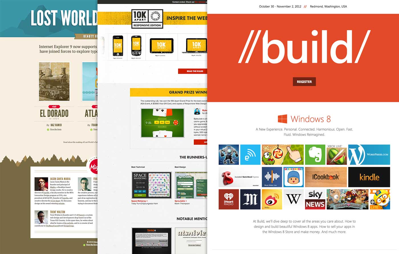
In my early discussions with the team, I'd outlined a model that involved bringing in some outside talent and integrating them carefully into the Microsoft team. Building mobile first web sites is a bleeding edge topic, and unless you're living on that edge, it's best to defer to the expertise of someone who is. I recommended Trent, Dave, and Reagan, the Austin boys behind my favorite design shop, Paravel, Inc. Having collaborated with the three amigos on several very successful and visible projects — Lost World's Fairs, 10K Apart, and most recently, the Build conference site — I was certain that they had the right skill set to complement that of the Microsoft team, but more importantly, the right attitudes.
The software industry takes pride in the technical interview. But what started with the noble intention of hiring the best people has turned into an often reductionist game of hiring those who excel on a singular axis: answering mostly ridiculous technical questions and brainteasers in the moment. The most regrettable casualty of these hiring practices is typically the emotional intelligence of the candidate. Simply put, their personality. This is ironic not only because the ability to write magnificent code or masterfully organize pixels often plays a very tertiary role in the process of innovation, but because it is ultimately balanced people coming together to solve a problem that leads to the kind of emotional experiences that make for hit software products today. My friend and hero, Bill Buxton, a decorated Microsoft designer, provides what I consider to be the best recipe for hiring such people.
Fortunately, Benson Chan, Raju's newly appointed Product Manager for Microsoft.com — in other words, the guy with the butt on the line for the user experience — got this better than most people. Benson and I grabbed lunch after I presented to his team, and he understood well that the key to success for this project was to create and empower a small team of the people who were I-shaped: the kind of people who were willing to try new things, challenge the status quo, balance theories with reality, learn from and support each other, and were willing to embrace our friends from Austin.
Not to mention, a group that was willing to reach into their gut to design the right experience.
The power of intuition was brought into the limelight in 2005 thanks to Malcolm Gladwell's national bestseller, Blink. What most people don't know is that Gladwell drew heavily from the research of a German psychologist, Gerd Gigerenzer, who's been publishing research and writing books on the topic since the 90's.
In Gut Feelings: The Intelligence of the Unconscious, Gigerenzer introduces us to a notion he dubs evolved capacities: complex capabilities given to us by nature, like sight or memory that we’ve evolved to unconsciously perform complex tasks, like the ability to track a moving object. As it turns out, humans are pretty bad at, say, predicting the trajectory of a ball. So, in order to actually catch a ball, we use certain evolved capacities in tandem with a rule of thumb called the gaze heuristic: fix your gaze on the ball, start running, and adjust your running speed so that the angle of the gaze remains constant.
If there is one thing Gigerenzer's research confirms without the slightest doubt, it's that our gut is truly intelligent. In fact, it is the primary mode of intelligence required in solving a gamut of problems — driving a car, catching a ball, predicting stock prices, making decisions on the battlefield, and countless others. My contribution to the list: Design.
Designing from the gut is a radical concept. It is generally met with a tremendous amount of friction in most software circles that tend to rely heavily on "logic and data" for all decisions. This is not to say that there isn't a place for telemetry or usability studies in the act of designing software. It's simply a question of when and where.
"In rethinking the user experience, we didn’t want to simply offer up X number of programmable slots. We got together as a team to discuss how to best create an experience to tell our product stories, meet the needs of our customers, and how we wanted to have a beautiful experience across any device. We drew learnings from analytics and previous A/B testing, but at the end of the day it was strategy by gut, tweaking by data." said Benson to me when we met in the RedWest campus of Microsoft a few days ago in reference to the impressive hero graphic that spans the top of the page. It's easy to understate the significance of his statement in the absence of context. But consider that the new hero graphic is a huge departure from the information architecture of the last few versions of the site. The image below speaks a thousand words that amount to: go with your gut.

The Microsoft.com team had the ability and freedom to make gut calls like this one, and this brings to the foreground the final and most important ingredient of this project that I can fit into the attention span of a Web reader.
"My favorite part of this project? Leadership. This project, more than any other I've been a part of, had leadership. Not management, but leadership," reflected Greg Bader, the Program Manager on Pita's team responsible for driving the execution and launch of the Microsoft.com home page project. Curiously, when I probed him about whom he considered the leader of this project, he said, "Well, Benson was a rockstar Product Manager. But we couldn't have done any of this without Tyson, who is the best developer I've ever worked with. But, Trent and crew brought such feeling and expertise to the project. I suppose none of this would have ever happened if Pita hadn't pushed for it and provided us air cover in the first place. I guess… everyone on the project was a leader."
This sentiment was echoed in my other informal conversations as well. "It wasn't about us vs. them. We were all in it together. It was very Gestalt," said Michael Ruggiero. "Never once did I feel that my own management was telling me what to do. My entire management chain just trusted us to go make the right calls," said Benson.
The most common cause of failure in most large organizations is micromanagement, not just by appointed leadership, but by everyone involved. And in terms of risk factors, this project exhibited far too many that could have led to a culture of micromanagement: a distributed team, a tight timeline, limited budget, complicated requirements, lofty goals, and not to mention, strangers from Austin taking the lead on design.
In the words of Peter Drucker, the man who is often credited to have invented management, "Management is doing things right; leadership is doing the right things." I repeatedly found examples of Drucker's wisdom whenever I stopped to peek into the progress of the Microsoft.com project.
And the payout for this management philosophy was significant.
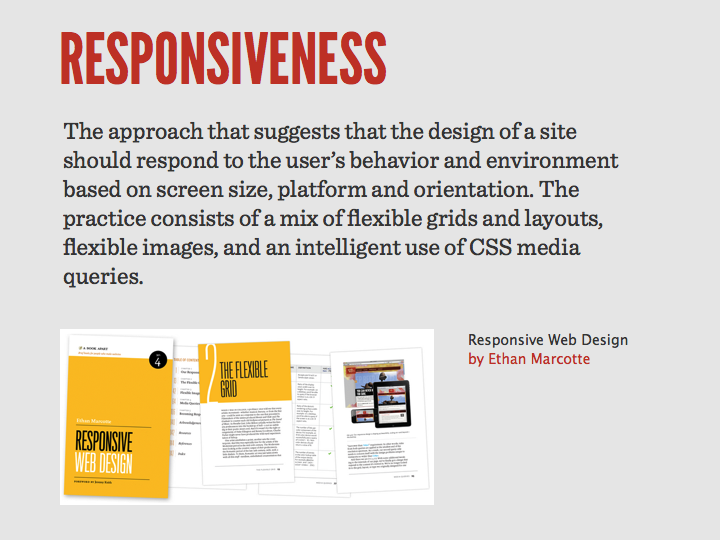
The new Microsoft.com home page is designed with a multi-device future in mind. And if you didn't already catch this, the page is, as Ethan Marcotte coined the term, Responsive. The Responsive movement rose from the proliferation of smartphones and tablets initially driven by Apple; ironically, even Apple.com is not responsive yet.
It's easy to dismiss this project by saying, "It's just a page. Big deal." That would miss the point entirely. It would also be entirely inaccurate. The Microsoft.com team built tools, guidelines, and processes to help localize everything from responsive images to responsive content into approximately 100 different markets. They built instrumentation to track the behaviors of their users on multiple axes. They built a device lab to test the page on a multitude of devices. They adapted their CMS to allow Content Strategists to program content on the site.
As the Microsoft.com case study on Paravel's site illustrates, the team built a bleeding edge site in the real world.
This project is innovation in its best form: the kind that has the courage to take bold yet calculated risks. And it represents the start of a movement, the type that has the power to ripple not only through a large organization, but the world. Shortly after the site previewed a couple of months ago, Luke Wroblewski, one of the leading experts on mobile first development and the author of an excellent book by the same title, tweeted —
Now when someone asks: "But are any big companies using responsive Web design?' You can answer: "Yes. Microsoft."
— Luke Wroblewski (@lukew) June 29, 2012
We tend to attribute singular causes to successful software projects: the developer was awesome, the designer was a rockstar, Basecamp made our project successful, management gave us all the freedom in the world, Steve Jobs, and the list goes on. We like our stories to have neat conclusions. It's just human.
But reality is much more nuanced and complex as the Microsoft.com story illustrates. Even as I wrote this post, I wondered to myself, "Was there one thing above others that made this project successful?" Was it that each member of this project team was humble? Or that there were clear accountabilities and roles across the board? Or that the timeline was just tight enough to force decisions? Or that the team members themselves had a certain level of experience in the industry? Maybe it was the undying trust that the leaders of the various teams placed in their employees?
The more I thought about it, the more reasons I came up with, and the tougher it became to weigh one higher than the other.
So, in the end, I can't give you one reason this project succeeded. I am compelled, however, to list all twenty-five —
Abe Thomas, Benson Chan, Bidur Adhikari, Chris Johnson, Claire Jennings, Dan Ma, Duane Clare, Greg Bader, Jeff Case, Joe Chung, Joseph Ho, Kalpita Kothary, Kavitha Mullapudi, Kimberly Wolk, Liliana Aguila, Michael Ruggiero, Mike Brewer, Mike Wu, Raju Malhotra, Rick Holzli, Sha Zhou, Steve McGinnis, Steve Whitford, Steve Yin, Tyson Matanich.